Southwest U.S. Summer Monsoon Season Precipitation Mapping
Updated: 06-22-2026
The maps below are focused on capturing unique elements of the summer monsoon season hydroclimate across Arizona and New Mexico including total precipitation, intensity, and frequency of precipitation events. Maps are updated once a day from June 15 - September 30th using gridded PRISM precipitation data (nominally 4km by 4km) provided by the Applied Climate Information System (RCC-ACIS). The daily data represent the 24 hour total precipitation measured at 12:00 UTC (locally 5:00am Mountain Time). PRISM data availability is lagged by one day so totals through 12Z of the previous day are available here. The gridded data provide a spatial estimate of true precipitation amounts across the region and should be interpreted with caution at very fine scales. More information on how the gridded data are produced can be found here.
Companion SW Monsoon climate monitoring products:
- Southwest U.S. Monsoon Season Technical Summaries
- Arizona Summer Monsoon Season Precipitation Mapping (NOAA-AHPS data)
- New Mexico Summer Monsoon Season Precipitation Mapping (NOAA-AHPS data)
Email Mike Crimmins with questions and/or suggestions on how to improve these plots or ideas for additional variables
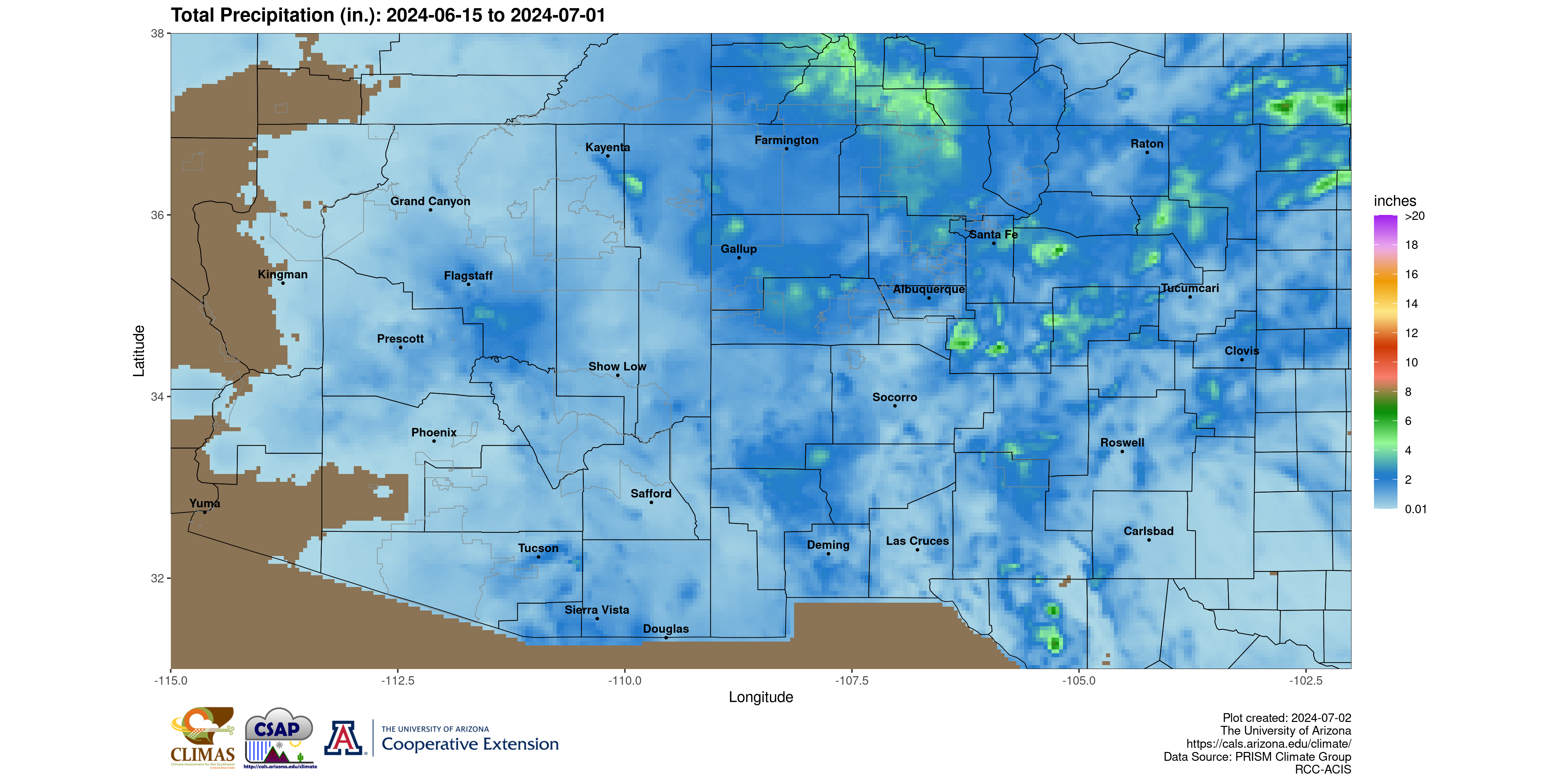
Total precipitation: Daily precipitation data summed from 6/15 to present.
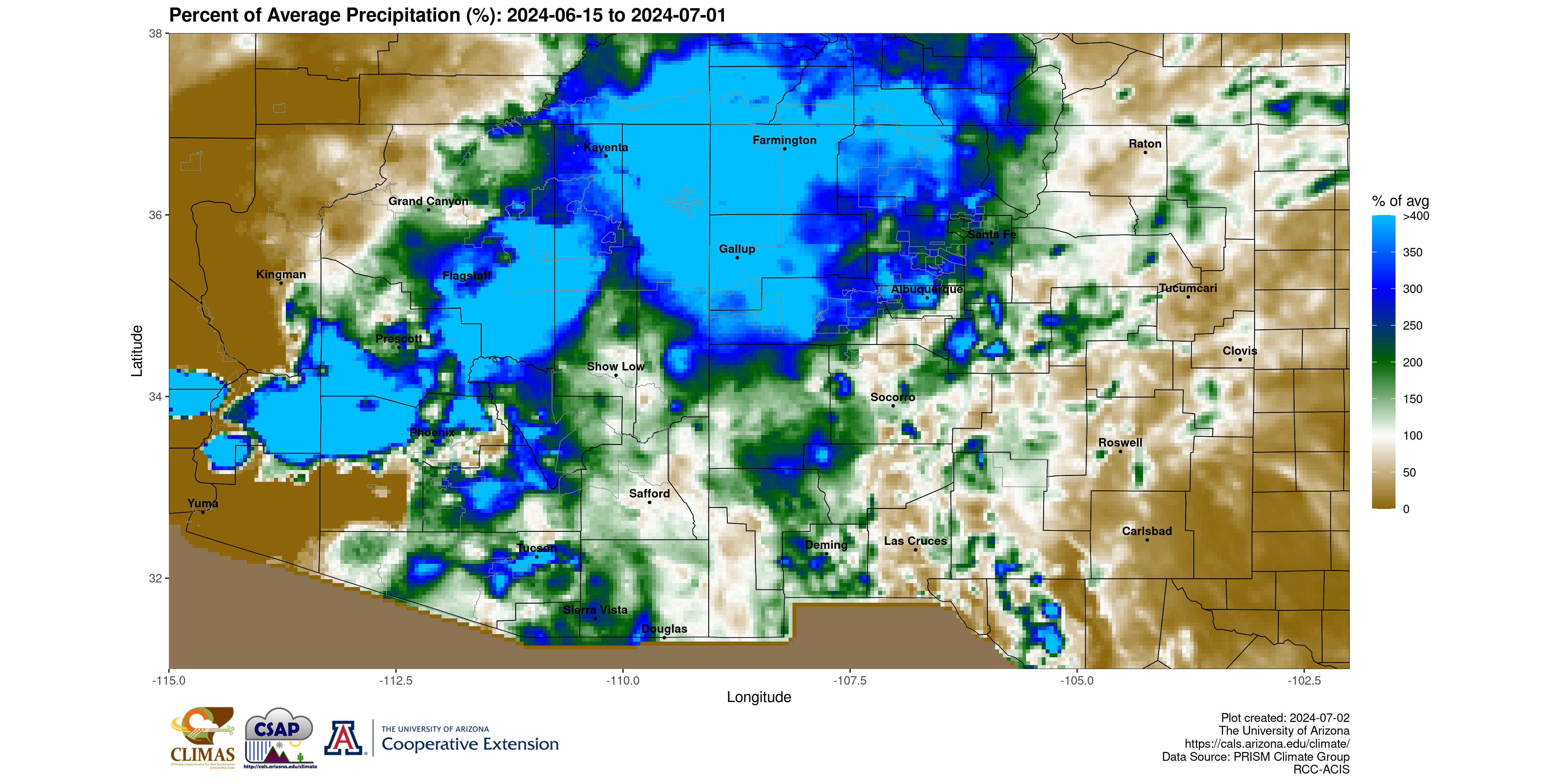
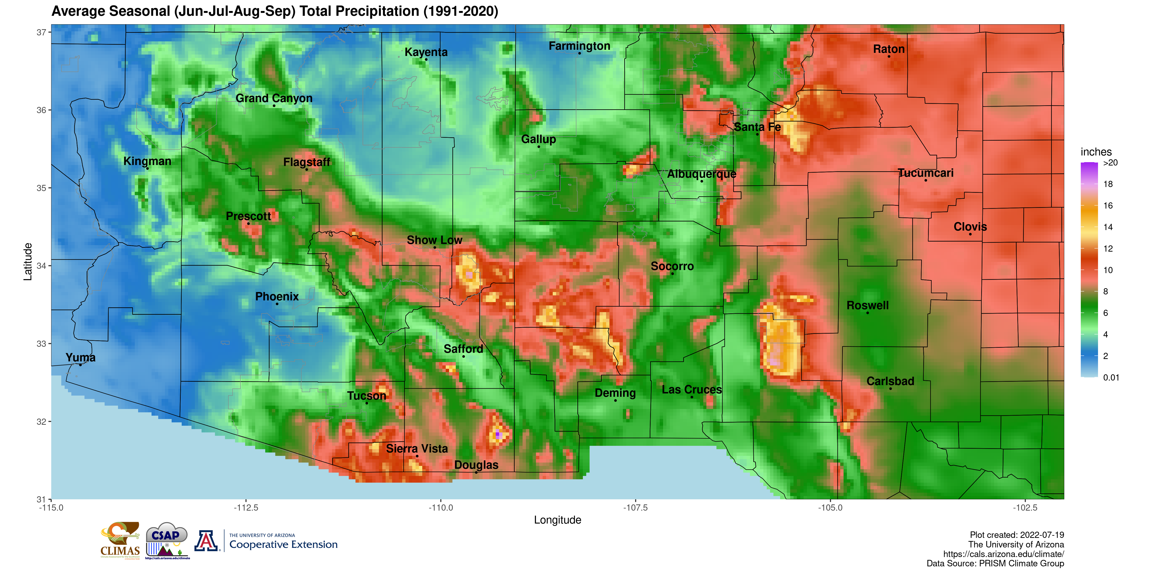
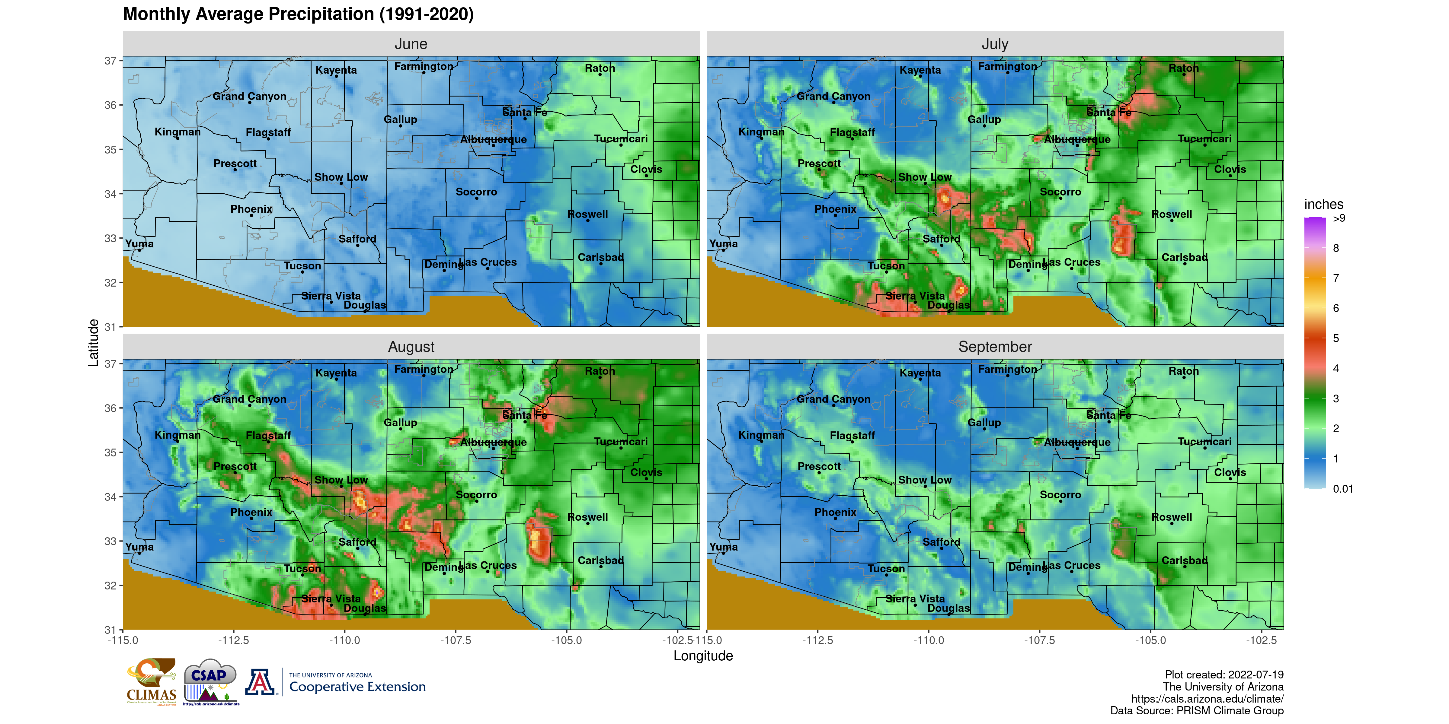
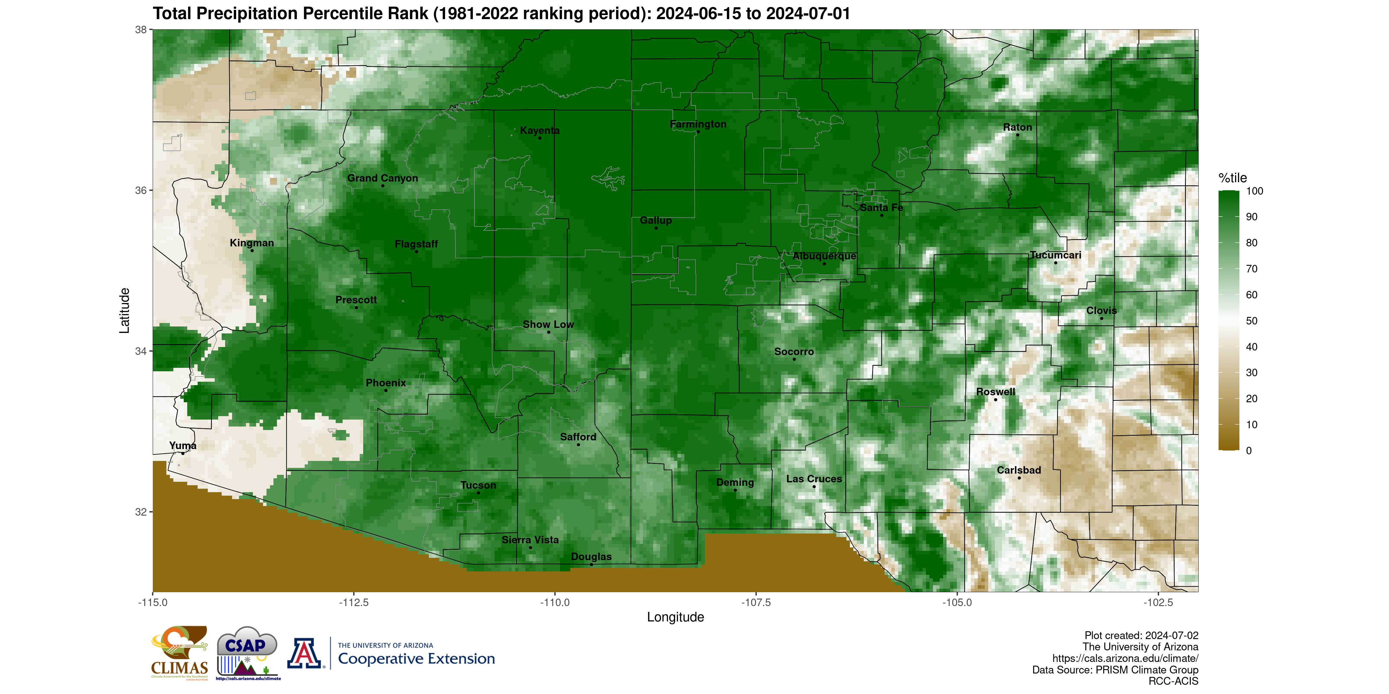
Percent of average precipitation: A measure of the difference from expected precipitation over the period of 6/15 to present calculated against a long-term mean (1991-2020). 100% is equal to average for the time period shown on the map. (see maps of Seasonal Average Total Precipitation and Monthly Average Total Precipitation). A Percentile Rank Map is also available based on rankings against the daily total 1981-2024 precipitation record (Interactive Map).
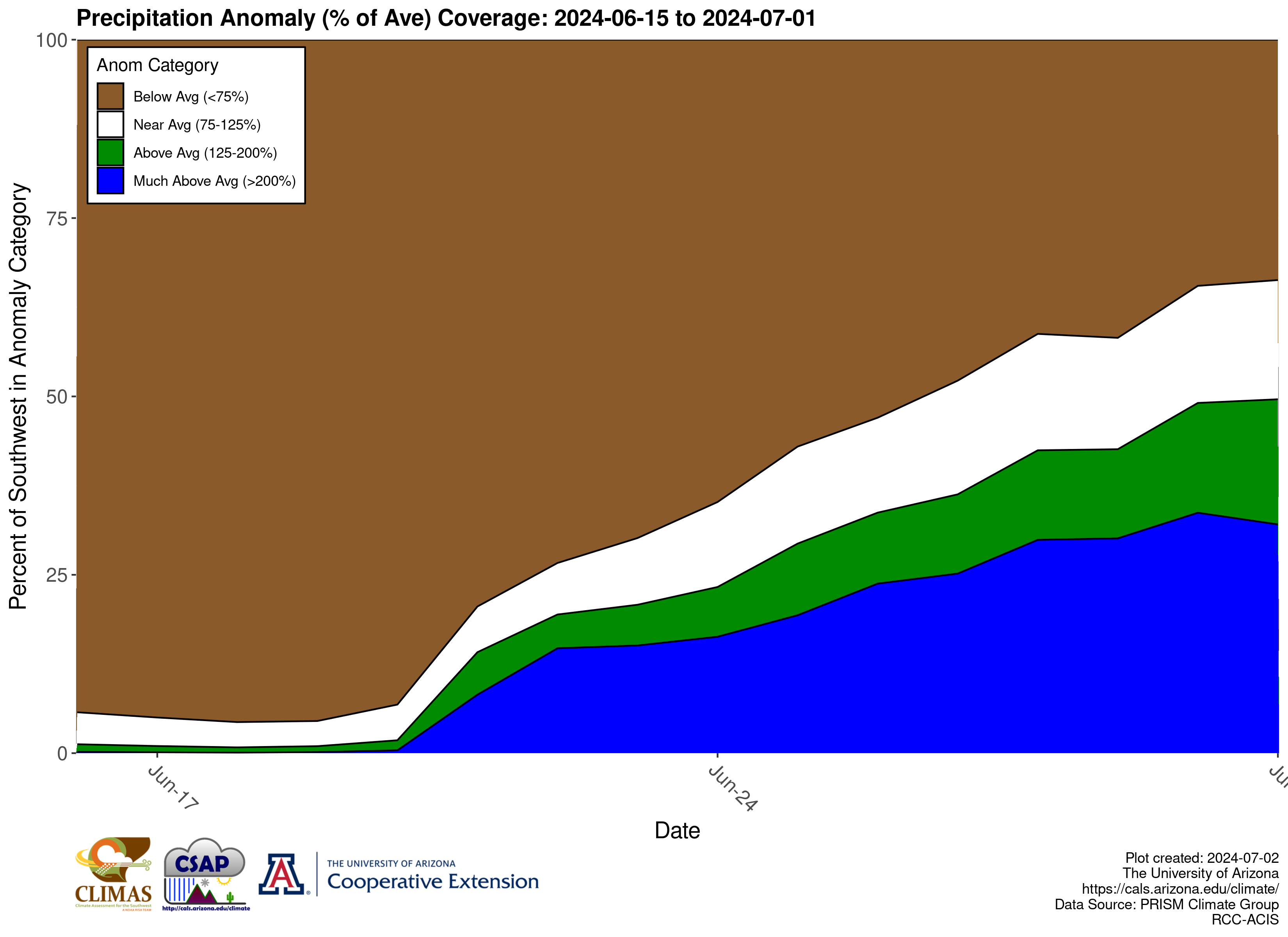
Daily precipitation anomaly coverage: This figure depicts the daily change in the coverage of different categories of precipitation anomalies or differences from average. It is calculated by counting the number of grid cells in each anomaly category (e.g. below or above average) each day and then dividing it by the total number of grid cells for the Southwest U.S. map area. For example, if the brown or below average category is greatest for any given day, then that indicates most of the region was observing below average precipitation.


Click on links below to enlarge
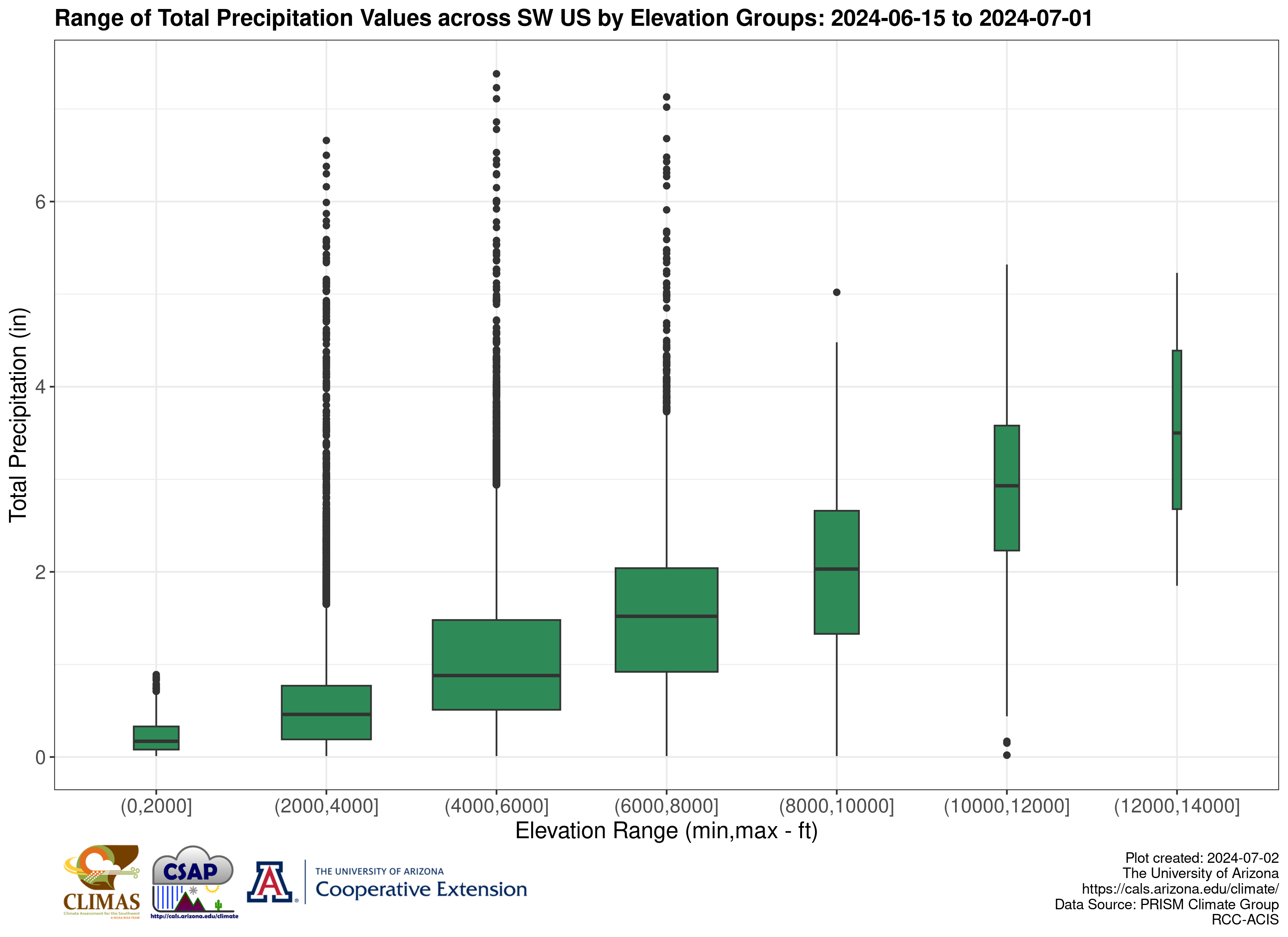
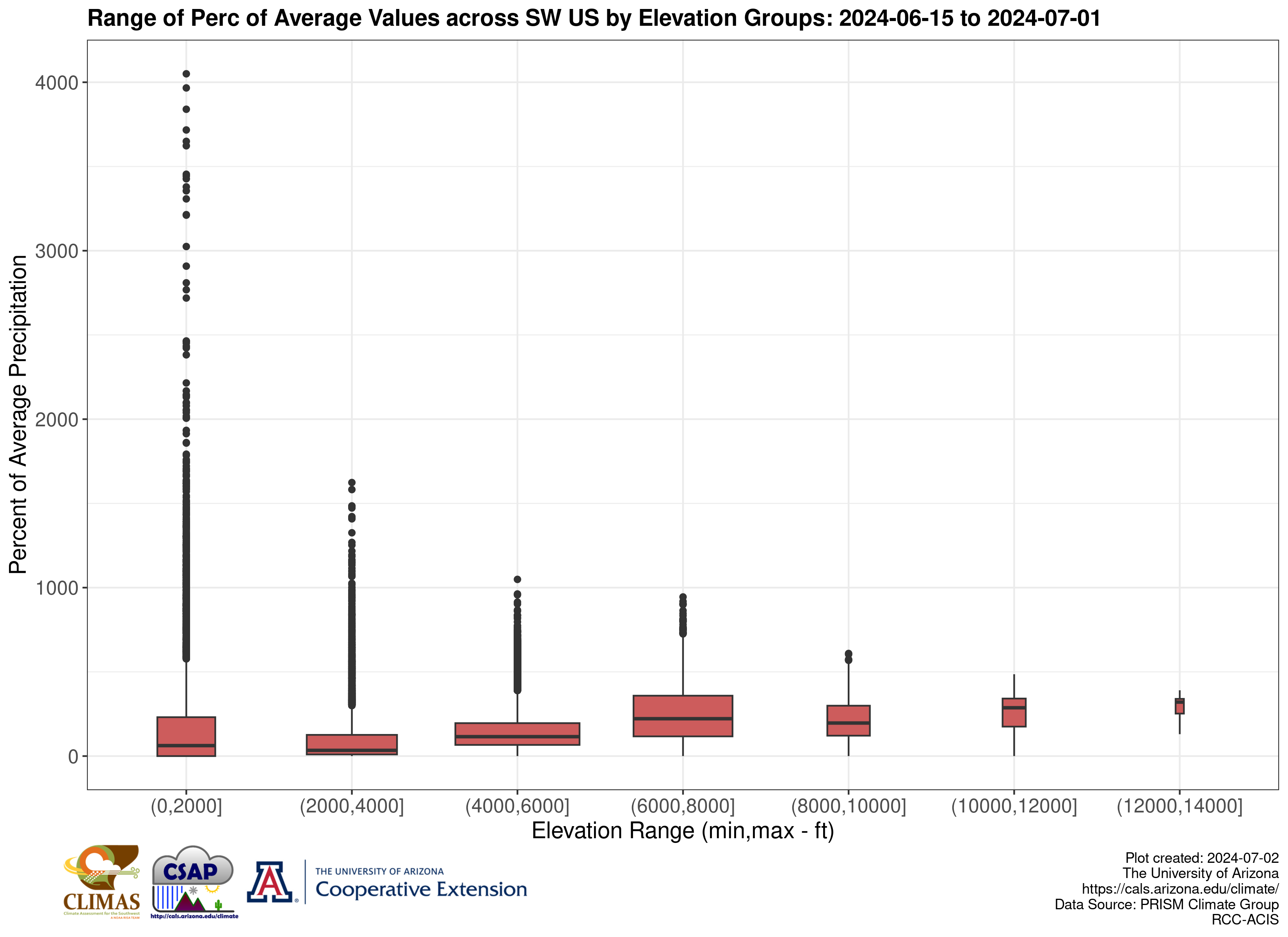
Total and percent of average precipitation by elevation range: These figure depicts the distribution of total and % of average precipitation values in a box plot grouped by different elevation ranges. The box represent the inter-quartile range of value while the black line is the median. Extremes are represented in the lines and dots sticking out of the boxes. The width of the box is proportional to the number of grid cells in that elevation range (e.g. narrower means fewer grid cells in that range). Information in these figures will help assess how precipitation patterns are aligning with topography across the region.
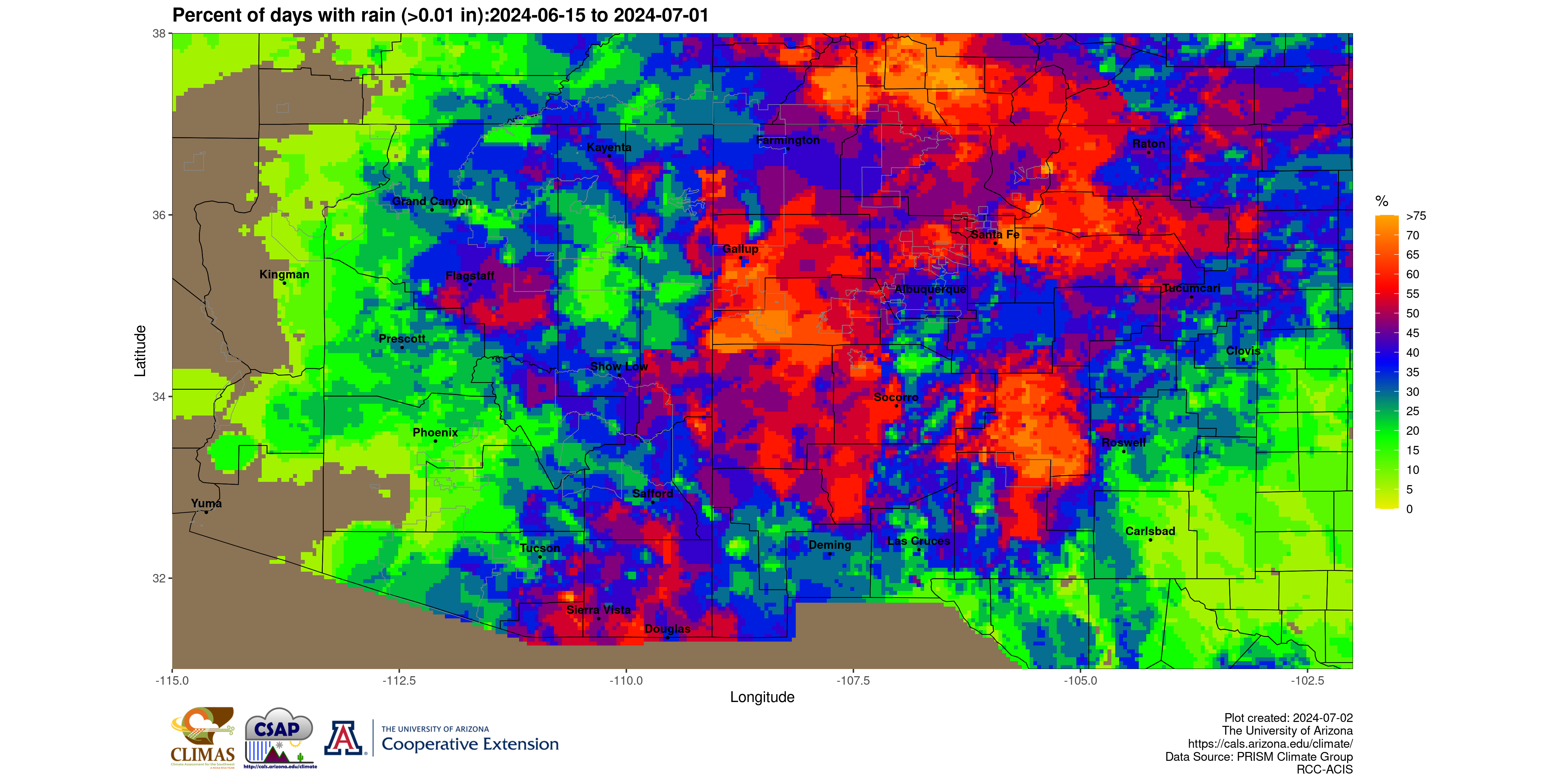
Percent of days with rain: Percent of days with rain: A count of days observing greater than or equal to 0.01” of rain divided by the number of days between 6/15 and the current date. A value of 50% indicates that rain was observed on half of the days between 6/15 and the current date.
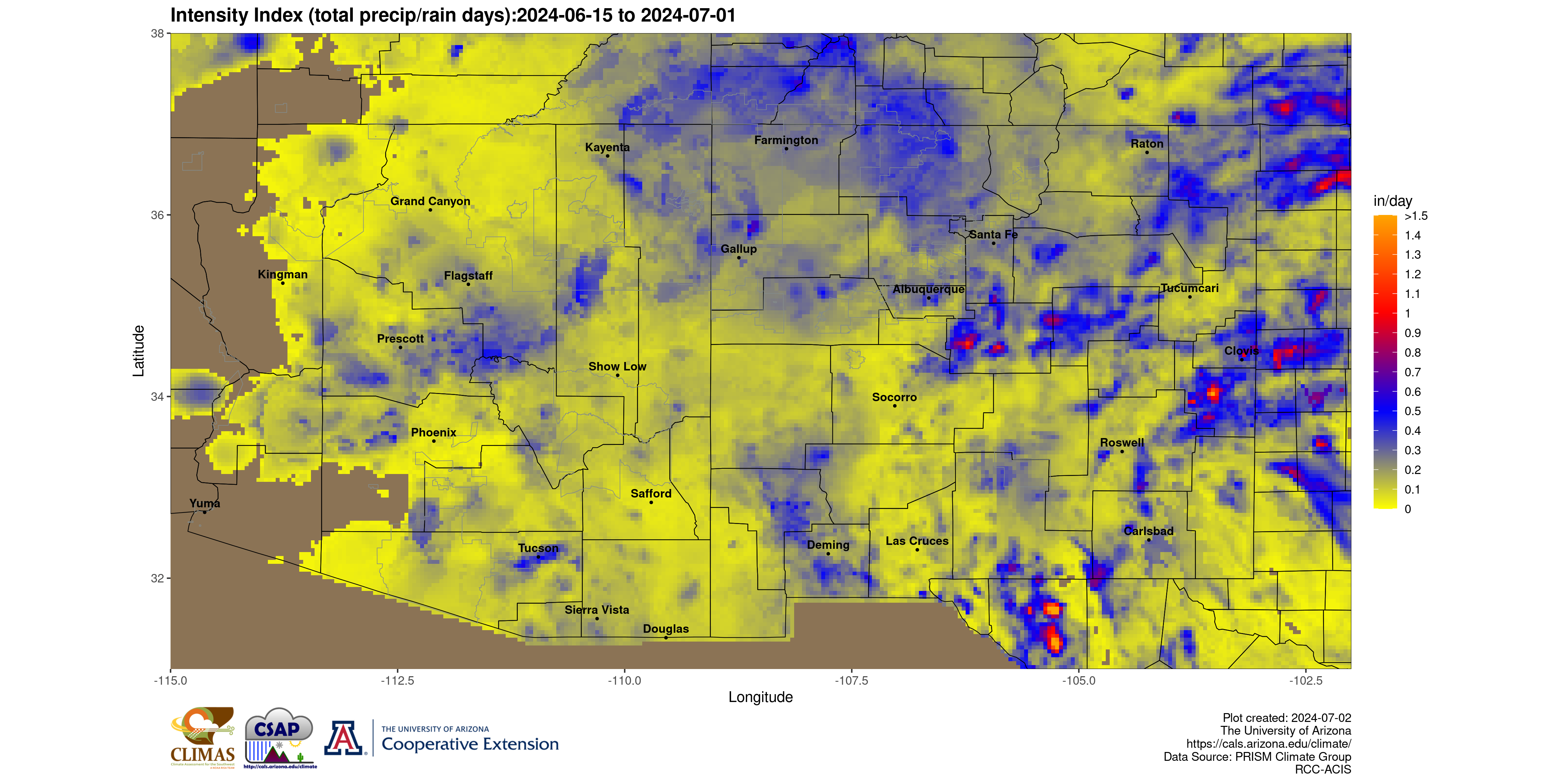
Daily intensity index: This index is the simple ratio between the total precipitation over the time period and the number of days observing rain with units of ‘inches/day’. A high value indicates that most of the total precipitation came in a small number of large or intense events.
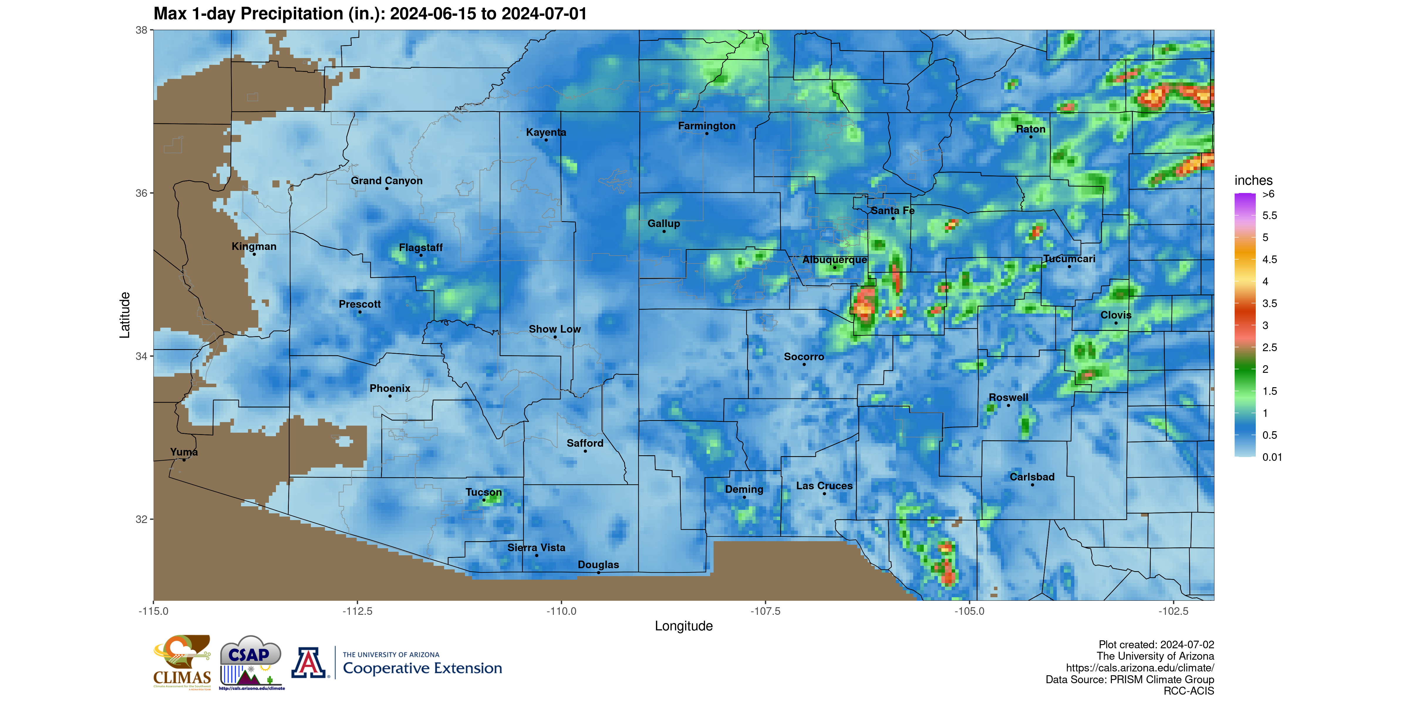
Max 1-day precipitation: This maps shows the single maximum 1-day precipitation amount observed in each data grid cell between 6/15 and the current date.
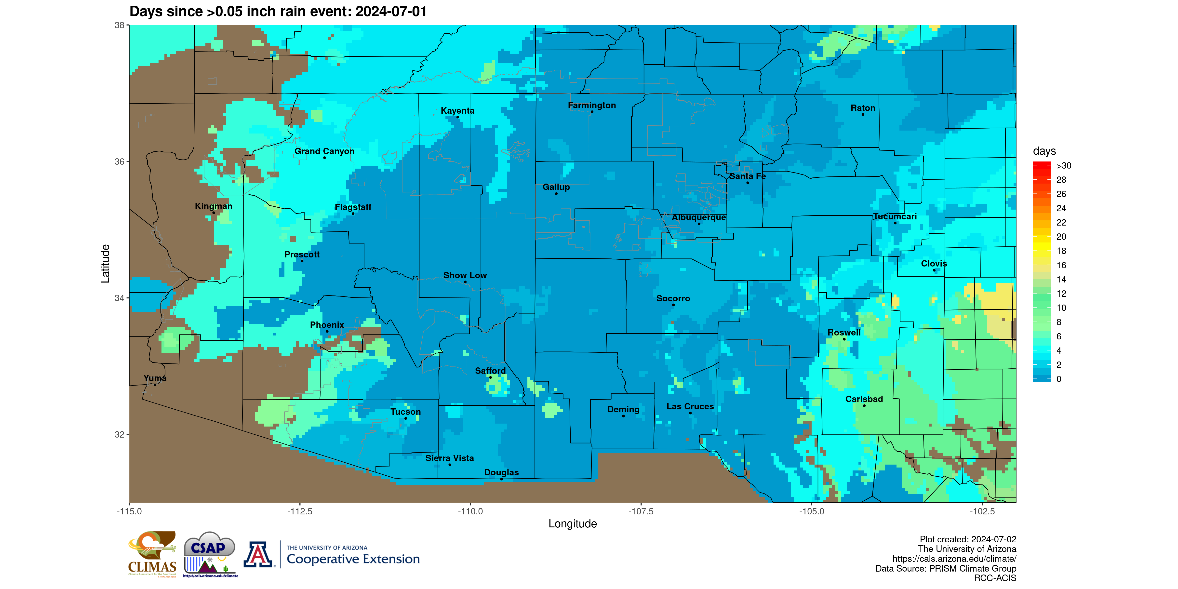
Days since 0.05” rain event: This map indicates the number of days since at least a precipitation amount of 0.05” was observed in each grid cell. Higher values indicate a longer time period or break since at least light rainfall was observed.
Most Recent 24-hr Precipitation (ending 5am MST on date listed)
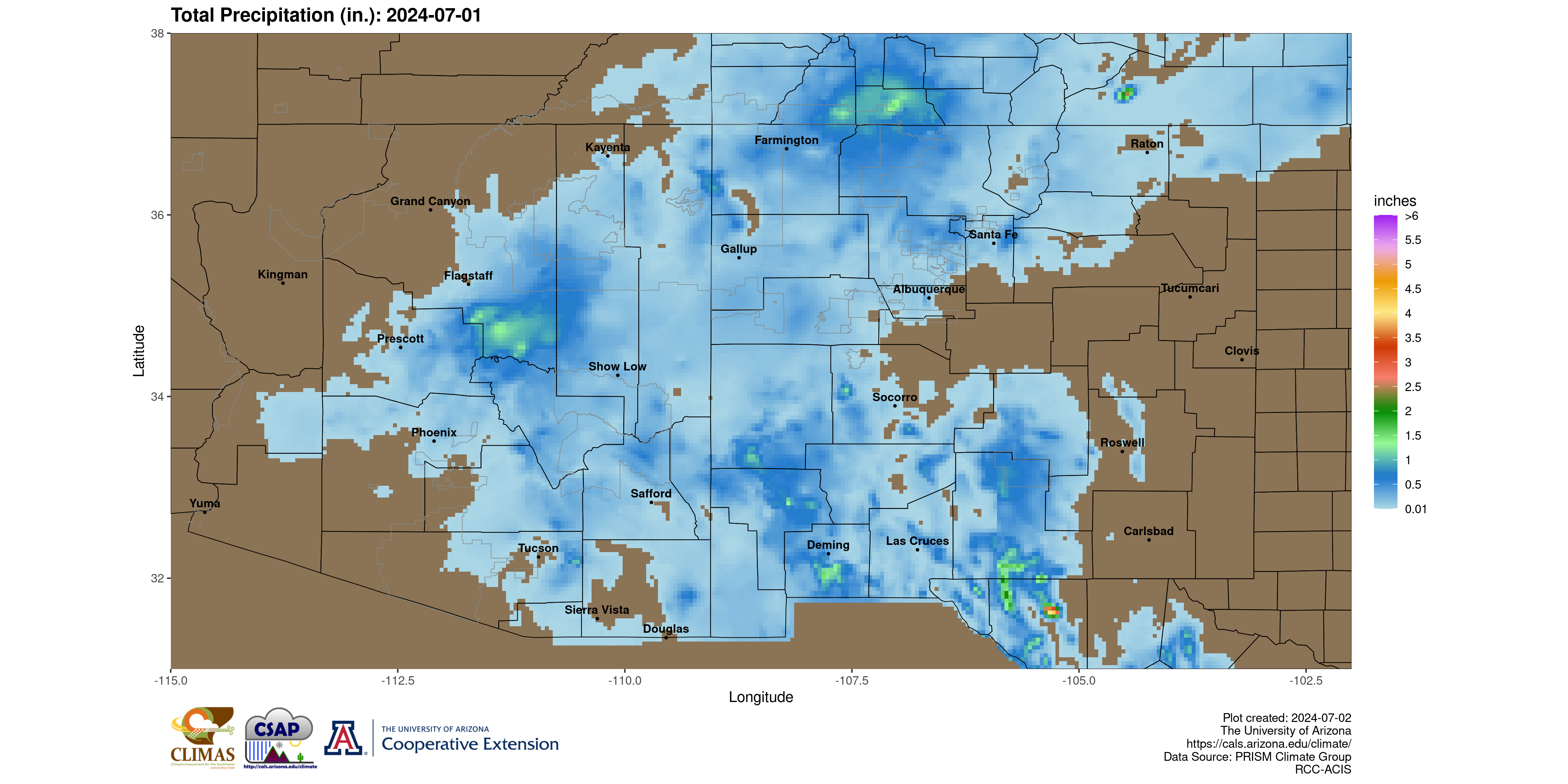
Recent precipitation: This map is the most recent one-day precipitation total. This ideally will be the total from yesterday through 12Z of the current day, but sometimes will often be lagged by one day.
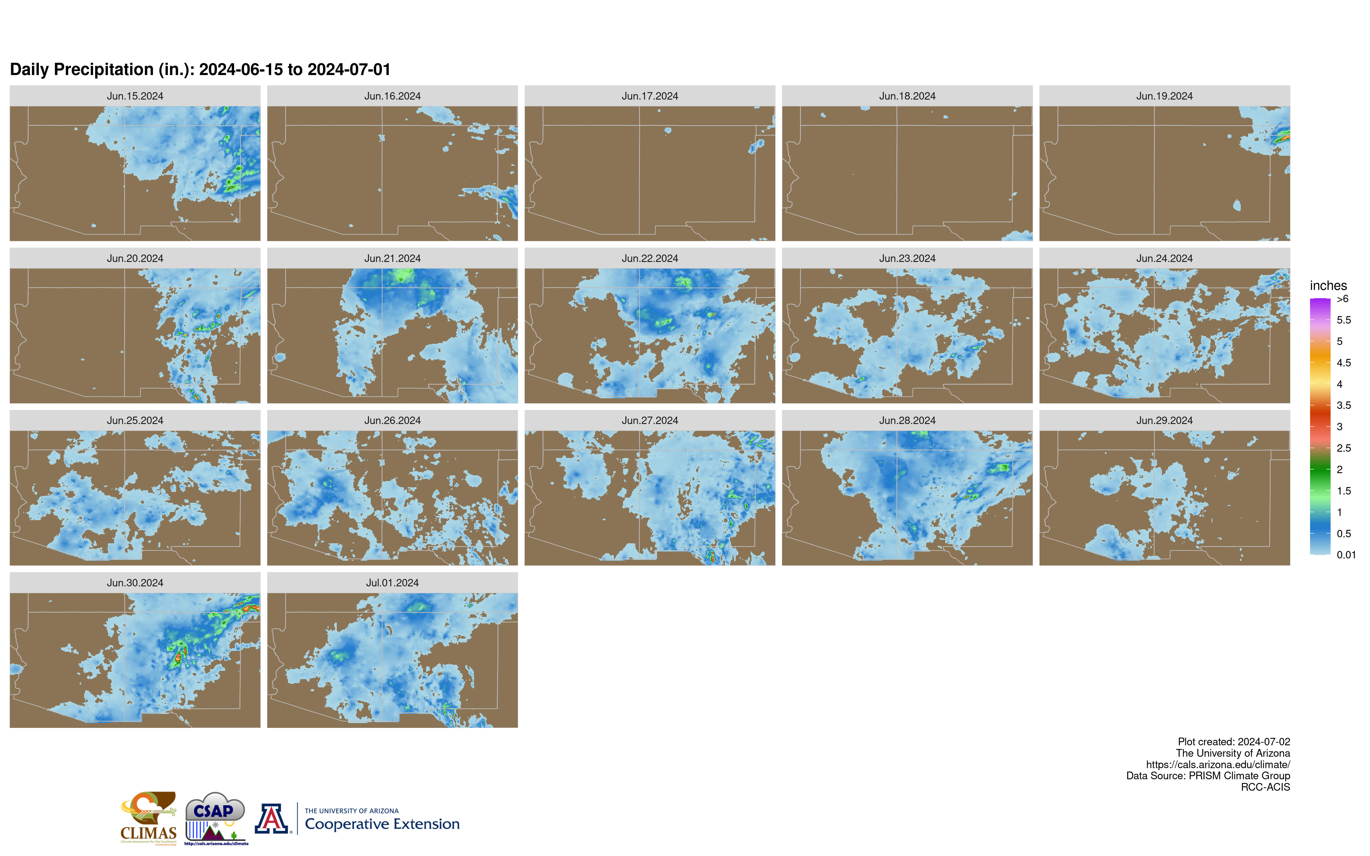
Daily precipitation synopsis: This figure shows a thumbnail snapshot of precipitation totals for each day in the current monsoon season and will grow by one map each day. Click on the link below to access individual daily maps.


Click on links below to enlarge
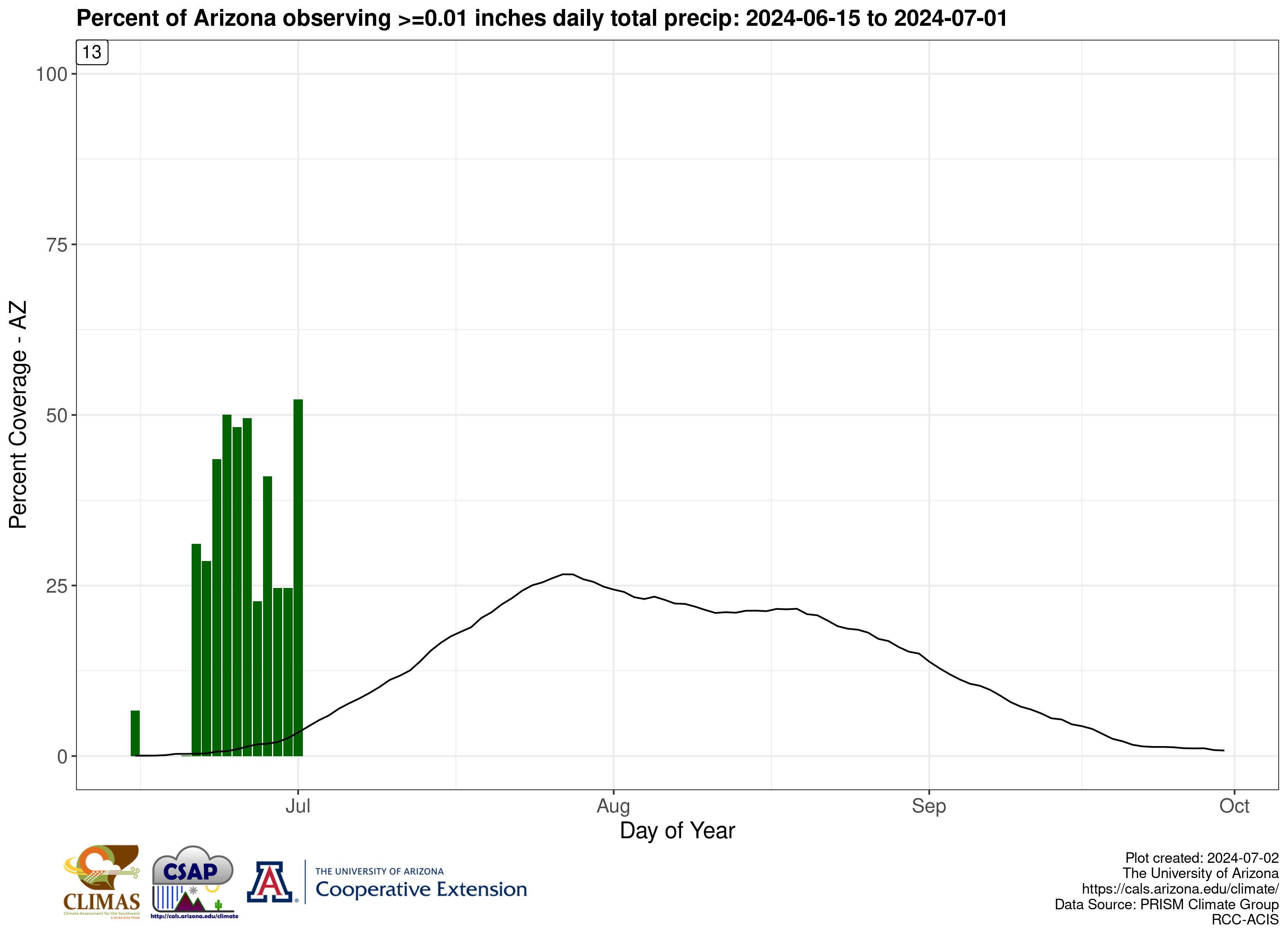
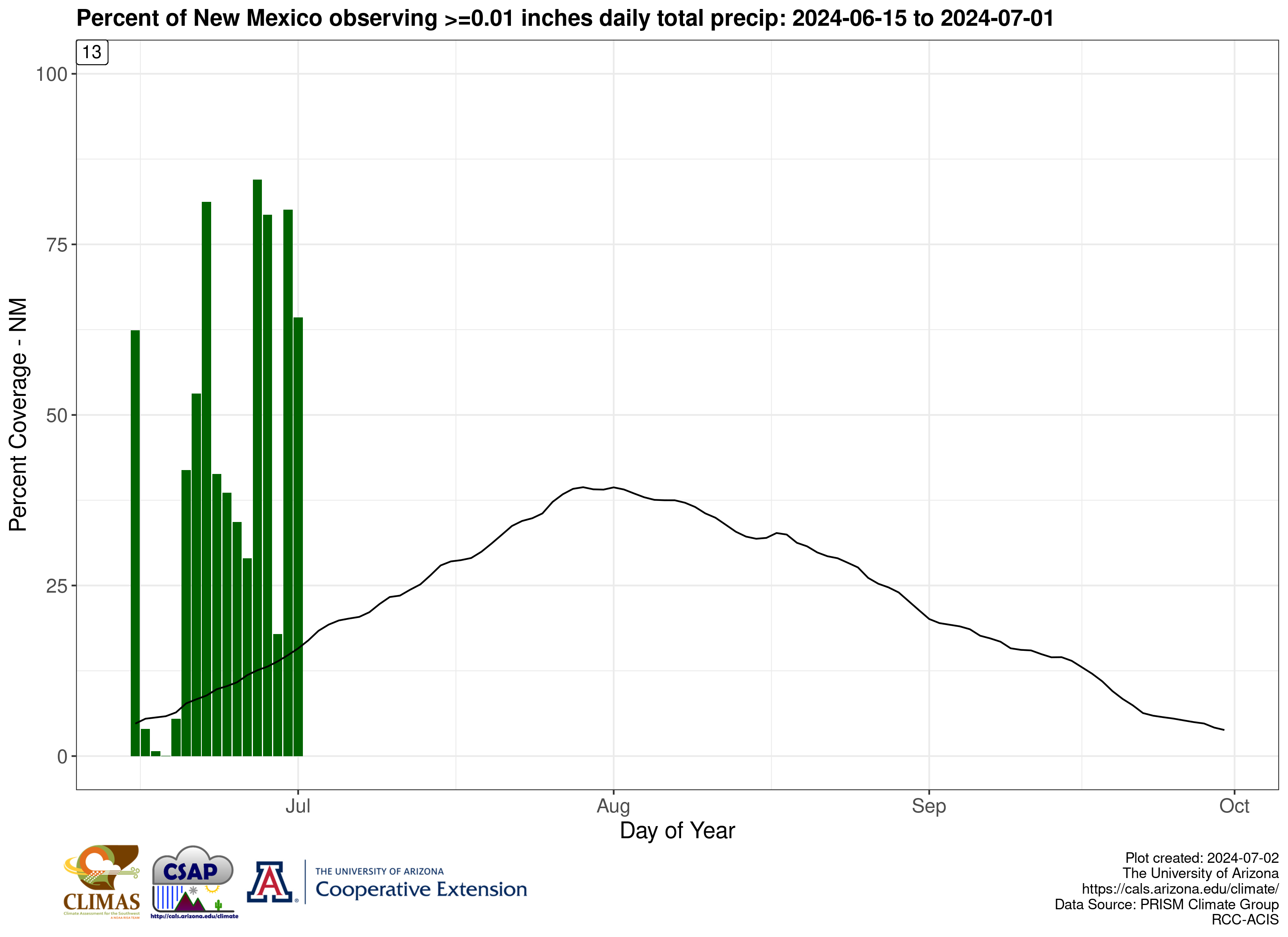
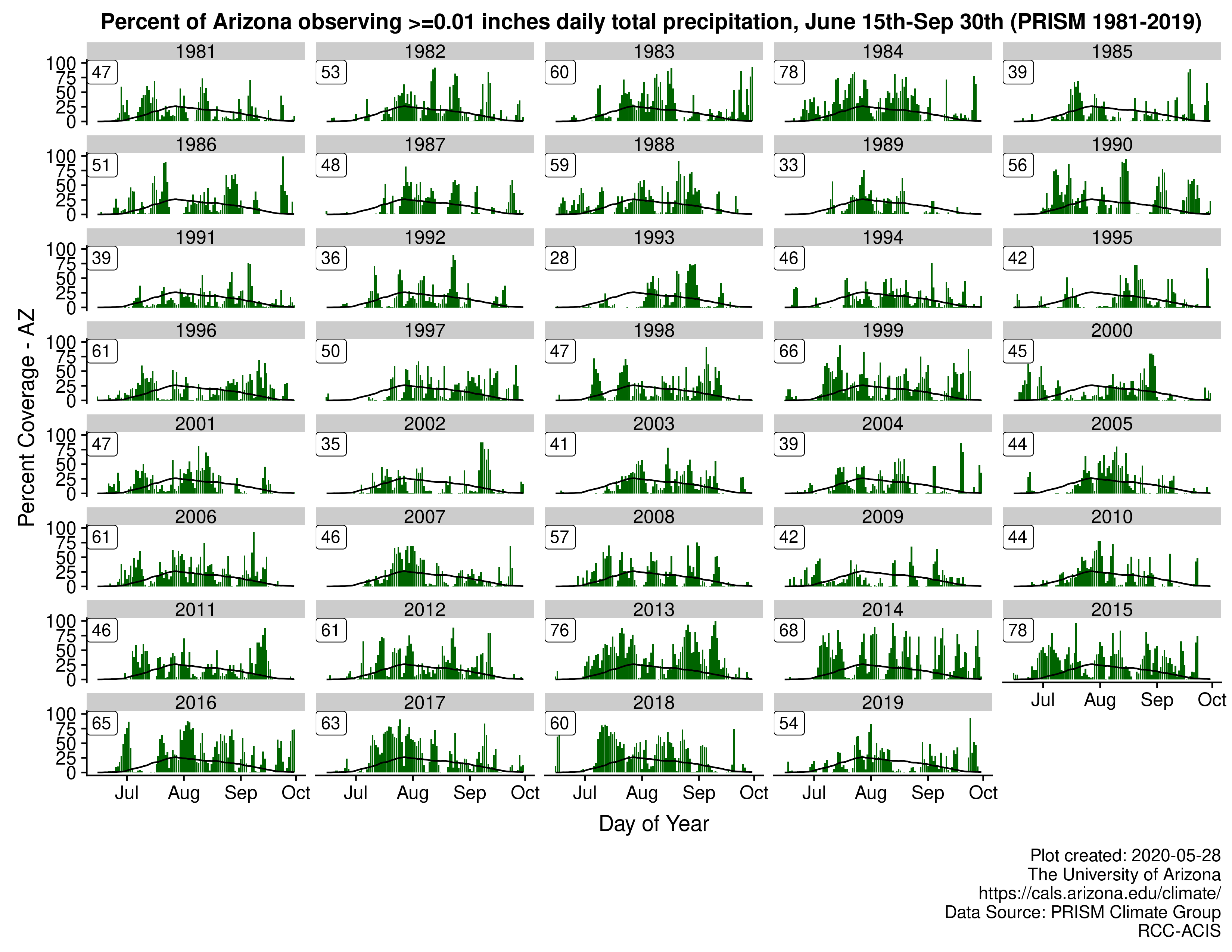
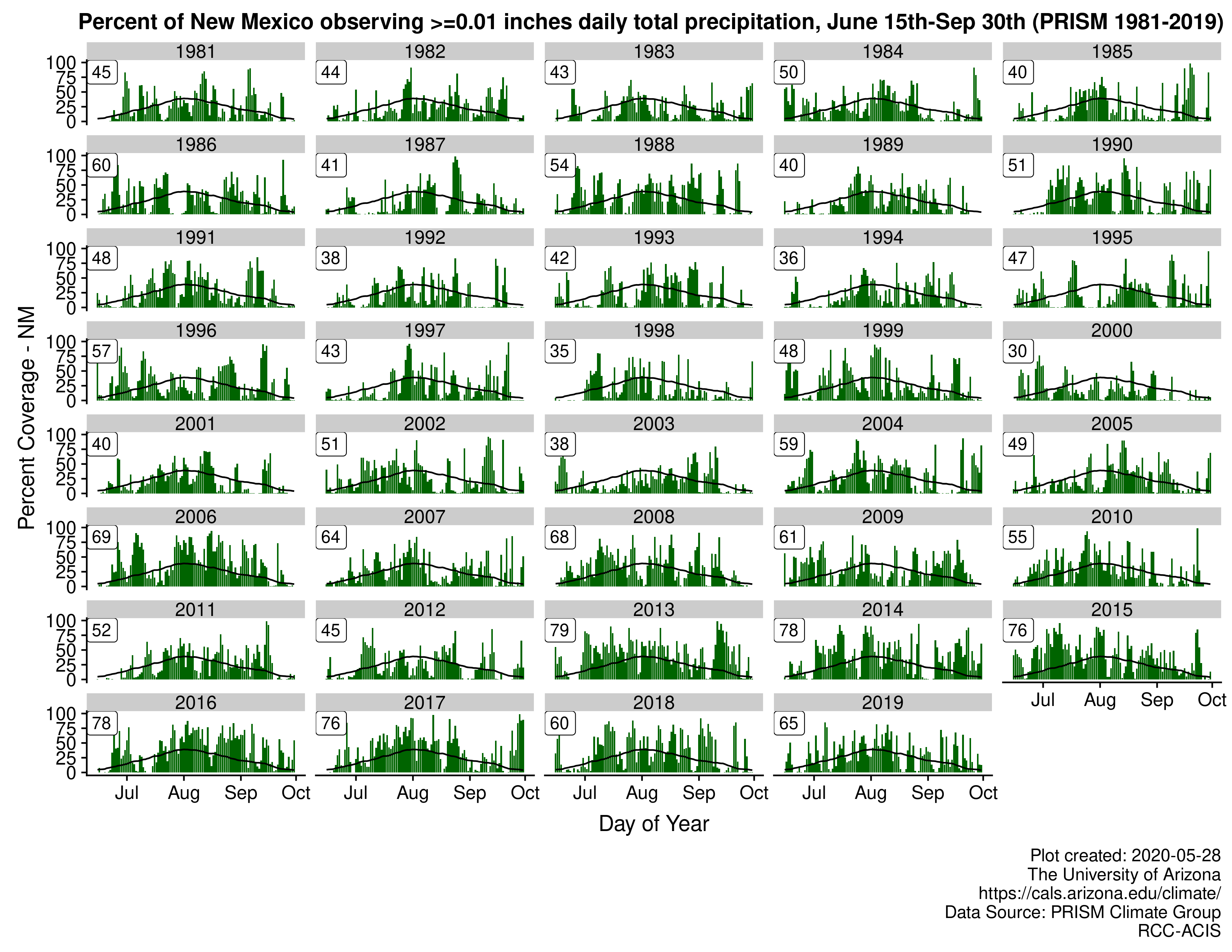
Extent of daily rainfall coverage for Arizona and New Mexico: These figures display the extent of rainfall coverage equal to or exceeding 0.01” for each day in the monsoon season across Arizona and New Mexico. For example, if all of the gridded precipitation estimates were >=0.01” for all grid cells in Arizona on a given day, the coverage would be 100%. The black line represents the smoothed median coverage for each day calculated using data from the 1981-2024 period. The number in the upper left corner of each plot is the number of days above the daily median value. (All years for Arizona and New Mexico)
Other SW monsoon season resources:
- Tucson - National Weather Service Monsoon Tracker
- Overview of Arizona and the North American Monsoon System
- CLIMAS Monsoon Overview Page
- North American Monsoon Experiment Webpage
- NOAA Climate Prediction Center Monsoon Monitoring
- Arizona Regional WRF Model Forecasts
- MadWeather Blog
